
Making your website “mobile friendly” just means it works great on a phone. The best way to do this is with a special kind of website design that automatically fits any screen, big or small. The words are easy to read, and the buttons are easy to tap. No more pinching and zooming for your customers. It’s that simple.
This isn’t some nerdy tech problem—it’s the first step to stop losing jobs you don’t even know you’re missing. And guess what? You can totally do this.
Why Your Website Is Secretly Costing You Jobs
Picture this: a customer’s septic tank backs up. They grab their phone, Google “septic repair near me,” and find your website. But it’s a jumbled mess! The words are tiny, the buttons are impossible to hit, and they can’t find your phone number.
Poof! They hit the ‘back’ button and call your competitor.
That’s a lost job. And if your site isn’t built for a phone, this is happening all day, every day. A bad mobile site is like a billboard with a blurry phone number. It makes you invisible when people need you most. This is step one in turning your website into a real lead machine.
The Mobile-First World of Local Business
Let’s be real. When someone’s basement is flooding, they aren’t booting up a dusty old computer. They’re on their phone, searching for help right now. This is where you either win or lose the job.
If your website is a pain to use on a phone, you’re losing a paying customer. You’re also telling Google your site isn’t helpful, which hurts your local SEO and makes it harder to show up on Google Maps.
Your website is your #1 salesperson. If it doesn’t work on a phone, it’s like having a salesperson who mumbles and can’t look you in the eye. It just doesn’t get the job done!
Most of your website visitors—up to 65%—are on their phones. But they don’t turn into leads because most websites are just plain frustrating to use on a small screen.
Here’s a quick look at how a mobile-friendly site helps you get leads versus how a broken one sends them straight to your competition.

Mobile-Friendly vs. Not Mobile-Friendly: What It Means For Your Business
| Feature | Mobile-Friendly Website (Gets You Leads) | Not Mobile-Friendly Website (Loses You Leads) |
|---|---|---|
| User Experience | So easy to use, a caveman could do it. | Frustrating. Makes you want to throw your phone. |
| Google Ranking | Shows up higher in local SEO searches. | Gets buried by Google. Invisible. |
| Calls & Leads | “Click-to-Call” button makes getting in touch a snap. | Phone number is hidden. Leads give up. |
| Reputation | Looks professional, shows off your 5-star reviews. | Looks broken and amateur. Kills trust. |
| Bounce Rate | People stay, look around, and call you. | People leave in 3 seconds and call someone else. |
The difference is huge. One makes your phone ring; the other makes your competitors’ phones ring.
Turning Your Website Into a Lead Machine
The good news? This is easy to fix. You don’t need to become a computer whiz. The goal is to turn your website from a sleepy, broken sign into a 24/7 lead machine that works as hard as you do.
A mobile-friendly site is a superstar at three things:
- Gets You Found: Google loves mobile-friendly sites and helps them rank higher in local SEO. More people see you when they’re ready to buy.
- Gets You Calls: With big, easy-to-tap “Click-to-Call” buttons, customers can call you in a single tap. No more fumbling around.
- Builds Your Reputation: It shows off your 5-star review generation efforts right away, building trust with new customers instantly.
When you make your website easy for mobile users, you make it easy for them to hire you. For more tips, check out our guide on why your website isn’t getting you customers.
This isn’t just about looking good; it’s about making your phone ring. We can help you fix this and start getting the calls you’ve been missing.
The Easiest Fix Is A Responsive Website Design
Okay, let’s get straight to it. When you hear a fancy term like responsive website design, it’s easy to tune out. But it’s actually the simplest and best way to make your website work on a phone.
Think of it this way: your website should be like water. It should perfectly fit any container—a giant computer screen, a tablet, or a tiny phone screen. A responsive website automatically changes its shape to look great on any device.
It’s not magic, just smart website design. The words are easy to read, the buttons are big enough for your thumb, and your customers never have to do that annoying pinch-and-zoom dance again.
Why This Is The Most Important Decision You’ll Make
Starting with the right kind of website is everything. If your website isn’t responsive, it’s like trying to win a race with a flat tire. You’ll never catch up. A non-responsive site will always feel broken to someone on their phone.
This is why every single lead machine we build is responsive from the get-go. It’s not an extra feature; it’s the only way to do it. Why? Because more than half of your customers will find you on their phones. If your site doesn’t work for them, you’re invisible to most of your market.
A good, responsive design is the secret to:
- Happy Customers: They can find what they need without getting angry and leaving.
- Better Google Rankings: Google loves responsive sites and boosts them in local SEO results.
- More Leads: When your site is easy to use, people are way more likely to call you.
How To Quickly Check Your Own Site
So, is your site responsive? You don’t need to be a tech expert to find out. Here’s a super simple way to check right now.
Go to your website on your computer. Grab the edge of your browser window and slowly make it skinny.
Watch what happens.
- Does it magically rearrange itself? Do the words and pictures stack up nicely? If so, congrats! Your site is responsive.
- Does it just get cut off? Do you have to scroll side-to-side to see everything? If a scroll bar appears at the bottom, your site is not responsive. It’s trying to cram a giant page onto a tiny screen—and failing miserably.
This simple test tells you everything. A website that can’t change its shape is a website that’s turning away customers.
This one thing—responsiveness—is the foundation of a great online presence. It affects your leads, your local SEO, your 5-star review generation, and even how well your Google Ads and Facebook Ads work. If you want to learn more, our approach to website design for small businesses is all about being mobile-first.
Getting this right isn’t a huge, scary project. It’s the easiest way to make sure you never lose another job to a competitor just because your website was a pain to use on their phone. You can do this!
Get More Calls With a Mobile-First Layout
When someone finds your website on their phone, they’re in a rush. They don’t want to look at pretty pictures; they want to call you, see if you work in their area, or check out your 5-star reviews right now.
If they have to pinch and zoom to find your phone number, you’ve lost them. They’ll just hit ‘back’ and call the next guy.
This is all about making it ridiculously easy for someone on their phone to become a customer. It’s about giving them what they need, the second they need it. On mobile, simple and fast is what turns visitors into a lead machine.

The Must-Haves For Every Contractor Website
For a contractor, your website is your best salesperson. But a site that isn’t built for mobile is a salesperson who can’t close a deal. In fact, 67% of people on their phones would rather buy from a site that’s easy to use. This means if your site is a pain, you’re just giving jobs away.
You can see more stats about this in this HubSpot marketing statistics report.
The fix is simple. It comes down to a few key things every contractor needs on their mobile site. These are the tools that turn your website into a powerful lead machine.
Here’s your simple checklist:
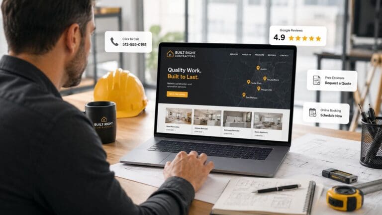
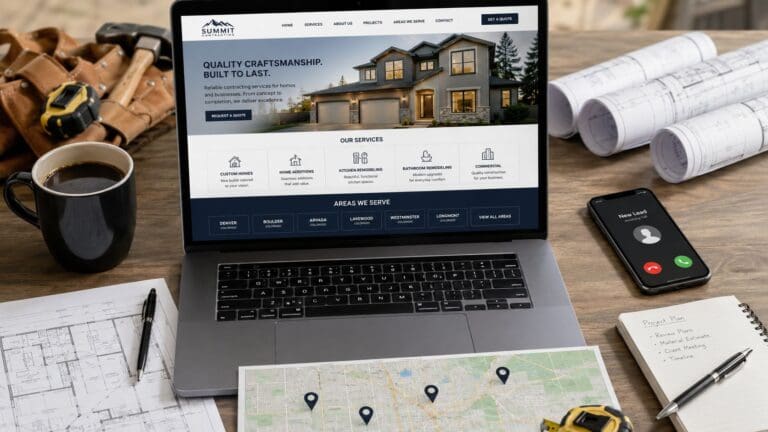
- A Giant “Click-to-Call” Button: Make this the most obvious thing on the screen. Big, bold, and easy to tap. Don’t make people search for your number; let them call you with one tap.
- A Google Map: People need to know you work in their area. A map showing your service area answers that question instantly and helps with local SEO.
- Visible 5-Star Reviews: Seeing good reviews builds trust right away. It tells people that you’re the real deal and their neighbors love your work. This is key for 5-star review generation.
Think like your customer. They’re stressed. Their toilet is overflowing. They don’t have time for a puzzle. They need help, and your website should be the fastest way to get it.
These simple things have doubled and even tripled the number of calls for companies we’ve worked with. It’s not rocket science; it’s just smart business. You can do this.
Why This Layout Is Crucial For Your Ads
Are you running Google Ads or Facebook Ads? If so, a mobile-first layout is a must-have.
Most people clicking your ads are on their phones. You are paying for every single click. If you send that traffic to a website that’s impossible to use, you are lighting your money on fire.
A good mobile site makes sure that the people who click your ads can call you right away. This makes your ads cheaper and gets you more leads for your money. Without it, you’re just paying to annoy your future customers.
The logic is simple. Make your site easy to use on a phone, and you’ll get more leads. For more on this, you can learn why you have to be mobile-first if you want your website to rank.
Look at your own website on your phone right now. Can you call yourself in one tap? If not, you’ve just found the easiest way to get more jobs.
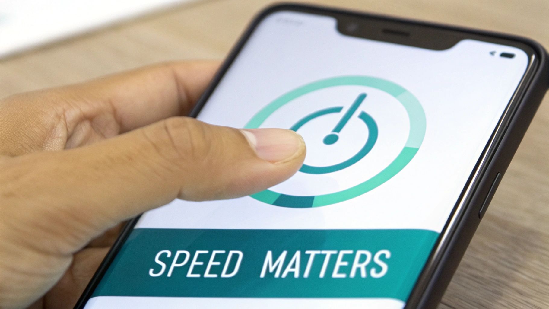
How A Slow Website Kills Your Leads
You know that feeling when you’re waiting for a slow website to load? That little circle just spins and spins. You get annoyed after a few seconds and leave.
Well, your potential customers do the exact same thing.
A slow website is a certified lead killer. It’s like having a disconnected phone line. Speed isn’t just a techy thing; it’s a “get paid or get ignored” thing for your business.
Every second a customer waits is another chance for them to hit the back button and call your competitor. A fast website is a critical part of your lead machine.
Why Speed Is A Money-Maker
Think about your customer. Their AC died on a hot day. They are in “get it done now” mode.
A fast website feels professional. A slow one feels broken and makes them wonder if you’re even still in business. This first impression happens in less than three seconds.
Imagine you’re running Google Ads. You’re paying for clicks, but if your site is slow, those expensive clicks are totally wasted. People will just leave before they even see your phone number.
In fact, every one-second delay can cause you to lose 20% of your potential leads. That’s a lot of lost money! You can see more data on how mobile speed impacts conversions if you want to nerd out.
Our Lead Machines are built to be lightning-fast because we know a fast site is the first step to getting a phone call.
The Biggest Speed Killers On Contractor Websites
So, what’s slowing your site down? It’s usually not some super-nerdy problem. It’s often a few simple things that are easy to fix.
The biggest bad guy? Giant photos.
You just finished a big job and have some awesome pictures. You upload them straight from your phone. The problem is, that photo is huge—way too big for a website.
These massive pictures are like trying to shove a bowling ball through a garden hose. It just clogs everything up.
A slow website is like having a salesperson who takes five minutes to answer a simple question. The customer is long gone by the time they get the answer.
Other common speed killers are:
- Too Much Junk: Websites with lots of silly animations and pop-ups are slow. A clean, simple website design is always faster and gets more leads.
- Cheap, Slow Hosting: Your website “lives” on a computer called a server. If that server is slow, your website will be too.
- Old, Clunky Stuff: If you use WordPress, old plugins can really slow things down.
Simple Fixes For A Faster Site
The good news is that you can fix this. You don’t need a computer science degree.
Start with your pictures. You can use free online tools to make them smaller without making them look blurry. A smaller picture means a faster website. It’s that simple.
Next, look at your homepage. Is it clean and simple, or a cluttered mess? A simple design is a fast design. It helps customers find what they need and makes your phone ring.
Also, good website hosting and domain names can make a huge difference. This isn’t just about being fast. It’s about keeping people on your site long enough to see your 5-star reviews, find your phone number, and decide to hire you.
We can help you build a website that’s not just mobile-friendly, but super fast, turning those visitors into real, paying customers.
Two Simple Ways to Test Your Website Right Now
So, how do you know if your website is a lead-generating machine or just a digital paperweight? You don’t have to guess. There are two super easy, free ways to check your site’s mobile-friendliness right now.
No tech skills needed. I promise. This is easy!
This is like getting a report card for your website. Knowing your score is the first step to making simple changes that get you more calls, more jobs, and more awesome 5-star reviews.
The Good Ol’ Fashioned Thumb Test
Let’s start with the easiest test in the world. I call it the “thumb test.”
Grab your phone and go to your website. Now, try to use it with only one hand, using just your thumb.
Seriously, try it.
- Can you easily tap the menu button?
- Is your phone number big enough to tap?
- Can you scroll and read your reviews without pinching and zooming?
If you’re struggling or squinting, you have a problem. If it’s hard for you, imagine how annoying it is for a customer in a hurry.
A customer who has to pinch and zoom is a customer who is about to leave. The thumb test tells you in 30 seconds if your website is a helper or a hindrance.
If you failed the thumb test, don’t worry. It just means you’ve found a huge opportunity to get more leads. The next test will give you the official word from the big boss—Google.
Getting Your Report Card From Google
While the thumb test is a good gut check, Google’s Mobile-Friendly Test gives you the hard facts. This is the official tool Google uses to decide if your site should show up high in searches. It’s free, fast, and so simple to use.
Here’s exactly what to do:
- Open your browser and go to the Google Mobile-Friendly Test page.
- You’ll see a box to enter your website’s address.
- Type in your website address and click the “Test URL” button.
That’s it. Google’s little robots will check out your site from a phone’s point of view.
Here is what Google’s Mobile-Friendly Test page looks like.
This screenshot shows the simple page where you just plug in your website to get your results.
After a minute, it will give you a clear answer: either “Page is mobile friendly” or “Page is not mobile friendly.” If you get the green light, awesome!
But if you get the red warning, don’t panic. The tool will even tell you why you failed, like “Text too small to read.” This isn’t a failure; it’s a to-do list. It’s Google telling you exactly what to fix to improve your local SEO and start getting more calls.
These two tests give you all the info you need. You now know if you have a problem and what it is.
And if this still feels like too much, that’s what we’re here for. At The Cherubini Company, we build powerful, simple lead machines that pass these tests with flying colors, so you can focus on your real job.
Your Simple Plan For A Money-Making Mobile Website
Okay, you know why a mobile-friendly site is a big deal. Now what? Let’s make a simple plan.
No confusing tech talk, just a straight line to turning your website into a lead machine that works on any phone.
Remember the goal: make it crazy easy for a customer to hire you. You can do this. It’s about focusing on what actually gets you jobs—getting found, getting calls, and building trust. This isn’t just about website design; it’s about turning your website into your best salesperson.
Your Mobile-Friendly Action Checklist
Let’s boil it all down. If you just focus on these things, you’ll be way ahead of your competition. This is how you turn a frustrating website into a steady stream of jobs.
- Choose a Responsive Design: Make sure your website can change its shape to fit any screen. This is the most important step.
- Prioritize Speed: Make your pictures smaller before you upload them. A fast website keeps customers around.
- Make Contact Easy: Add a giant “Click-to-Call” button that’s always on the screen.
- Show Off Your Reputation: Put your 5-star reviews right on the homepage to build instant trust.
This two-step flowchart shows a simple way to check your site.
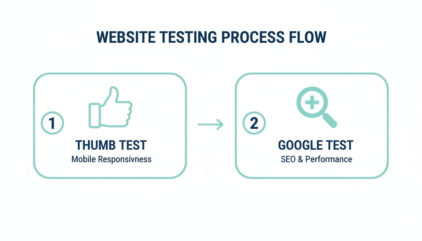
This process shows how a quick “thumb test” and Google’s test give you a full picture. It’s how you know if you’re good to go.
If this checklist still feels a bit much, that’s okay. We build powerful, simple lead machines that handle all of this for you. We help you stop losing leads and start getting the calls you deserve, so you can focus on running your business.
To see more must-haves, read our guide on the 12 website must-haves that actually generate leads.
Frequently Asked Questions
You’re not alone. Here are the questions I hear all the time from business owners trying to figure this out.
How Do I Know If My Website Is Mobile Friendly Right Now?
The fastest way is to use Google’s free Mobile-Friendly Test tool. Just type in your website address, and it’ll give you a simple “yes” or “no.” It’s that easy.
Another great way is the “thumb test.” Go to your site on your phone and try to use it with just your thumb. If you have to struggle or zoom in, your customers are struggling too. That means your site isn’t friendly enough to be a good lead machine.
Will A Mobile Friendly Site Help Me Show Up On Google Maps?
Absolutely. It’s a huge deal for local SEO. Google wants to show people helpful results, and a website that works on a phone is helpful.
When your site is easy for mobile users, Google is way more likely to show your business in the map results. That’s where local customers are looking for help! It’s like getting a VIP pass to the front of the line.
Fixing your mobile site directly helps you get more local calls and jobs. It’s that simple.
Is A Mobile Friendly Site Important For My Facebook And Google Ads?
It’s everything. If you’re paying for ads, you’re just burning money if you send people to a website they can’t use. Most people on Facebook or Google are on their phones.
Sending paid traffic to a broken mobile site is like buying a Super Bowl ad and then unplugging your phone. What a waste!
A mobile-friendly site makes sure that every single person who clicks your ad has a good experience. That means they’re far more likely to call you, making your Google Ads and Facebook Ads way more successful.
Stop letting a clumsy website cost you jobs. The Cherubini Company builds simple, powerful Lead Machines that are mobile-friendly from day one, designed to make your phone ring. Let us fix your website so you can get the calls you deserve.
Schedule your free consultation today!