Ever feel like your website is just… there? Like a lonely billboard in the desert? You built it, but nobody’s calling, nobody’s buying, and you’re starting to think it was a huge waste of time. Don’t worry, you’re not alone! Your website should be your best employee, working 24/7 to bring in customers. If it’s not, it’s time for a simple tune-up, not a crazy expensive makeover.
Here’s a little secret: a great website isn’t complicated. It’s about making a few smart, simple choices. We’re going to share some super easy small business web design tips that will turn your site from a digital ghost town into a busy, money-making machine. Think of it like fluffing the pillows on a couch to make the whole room look better. These are the simple tweaks that make a huge difference. You can totally do this!
Your website is the digital front door to your business. It’s the first thing people see! Just like the different types of commercial signs get people to walk into a real store, a great website pulls them in online. Ready to make your website work as hard as you do? Let’s dive in.
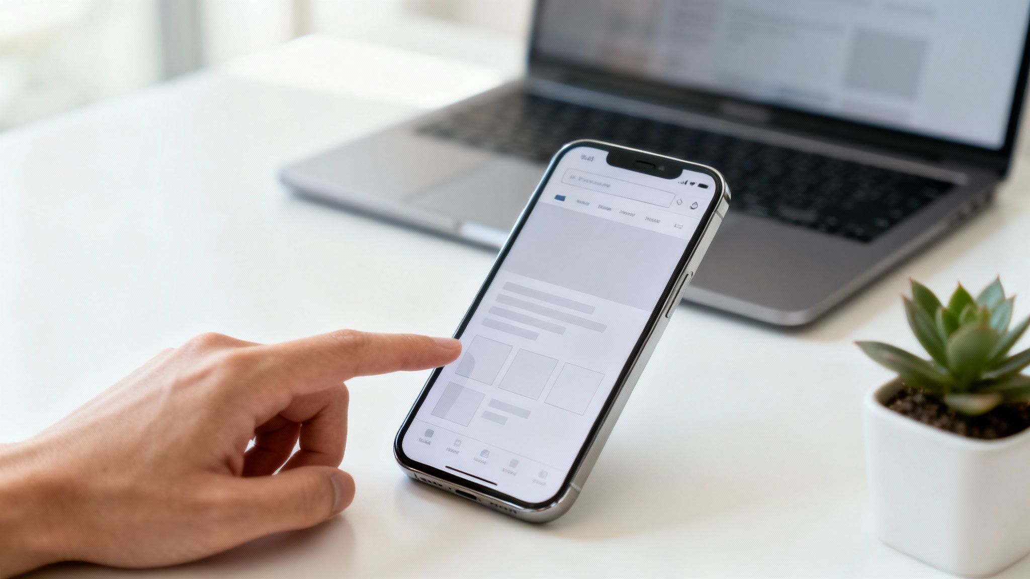
1. Make it Work on a Phone First
This just means you should design your website for a small phone screen first, and then make it look good on bigger computer screens. Think of it like building a fantastic LEGO car before you try to build a giant LEGO castle. It’s way easier! Most of your customers will find you on their phones, so this is one of the most important small business web design tips you can follow.
This way, your site will be fast, easy to use, and look great for almost everyone who visits. When someone is on their phone looking for a plumber in Columbus or a restaurant in Newark, you want them to have a super smooth experience, not a clunky one where they have to pinch and zoom.
Why It’s a Big Deal
Google now mainly looks at the phone version of your website to decide where to rank you in search results. So, if your site doesn’t work well on a phone, you might as well be invisible! By making your phone site awesome, you’re telling Google you care about your visitors, which can help more people find you.
Super Simple Tip: A great phone website isn’t just a shrunken-down computer site. It’s a totally fresh look, focused on what someone on a phone needs most: quick info, easy-to-tap buttons, and super-fast loading.

How You Can Do It (It’s Easy!)
Making your site work on a phone is easier than it sounds. You can start right now!
- Make Buttons Big Enough: Make sure all your buttons and links are easy to tap with a thumb. No one likes trying to hit a tiny button and missing ten times!
- Keep Forms Short: Nobody wants to fill out a long form on their phone. Just ask for the important stuff, like a name and phone number.
- Test it on a Real Phone: Don’t just look at the “phone view” on your computer. Grab your phone and a friend’s phone to see how your site really looks and feels.
This is a must-do for any business that wants local customers. Making your website phone-friendly is step one, and you can definitely do it. If you need a hand, we’re here to help make your website look amazing on every screen.
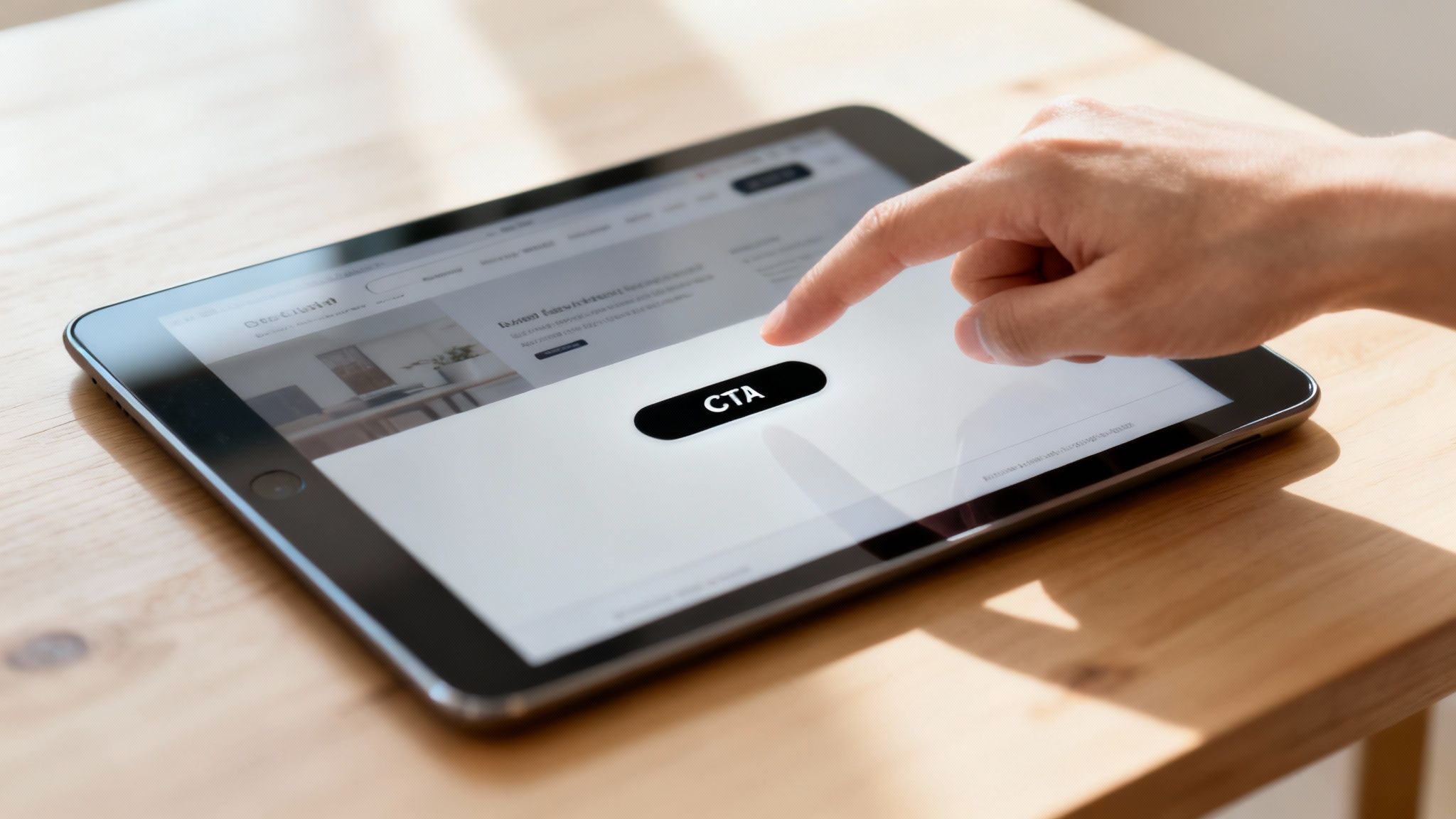
2. Use Big, Obvious “Do This Next” Buttons
A “Call-to-Action” (or CTA) is just a fancy name for a button on your website that tells a visitor what to do next. Think of it as a friendly signpost that guides people from “just looking” to “I want to buy!” Without clear buttons like “Get a Free Quote” or “Book Your Spot,” your visitors might just wander off.
For any small business, from a Columbus roofer to a Newark diner, a good button is the difference between a website that just looks nice and a website that actually makes you money. It turns a window shopper into a real customer.
Why It’s a Big Deal
People are busy and don’t want to think too hard. Clear, fun buttons take the guesswork out of it. By using bright colors and exciting words, you make it super easy for someone to know what to do. A good button makes them feel like clicking it is the best idea they’ve had all day.
Super Simple Tip: The best buttons use words like “My” or “Me.” For example, “Get My Free Estimate” works way better than just “Submit” because it feels more personal.
How You Can Do It (It’s Easy!)
Adding powerful buttons is one of the quickest and best small business web design tips you can use. You can do this today!
- Use Action Words: Start your button text with a strong verb. Instead of “Contact,” try “Get Your Free Quote Now!” Be clear about what they’ll get.
- Make Your Button Pop: Use a color that stands out from the rest of your website. Bright oranges, greens, or reds often work great because they catch the eye.
- Put Buttons Everywhere: Don’t make people hunt for the button. Put one at the top of your page, another in the middle, and one at the very bottom so it’s always easy to find.
This is a huge deal for any business that needs leads. It’s a tiny change that can bring in big results. And guess what? We can help you design buttons that people can’t resist clicking!
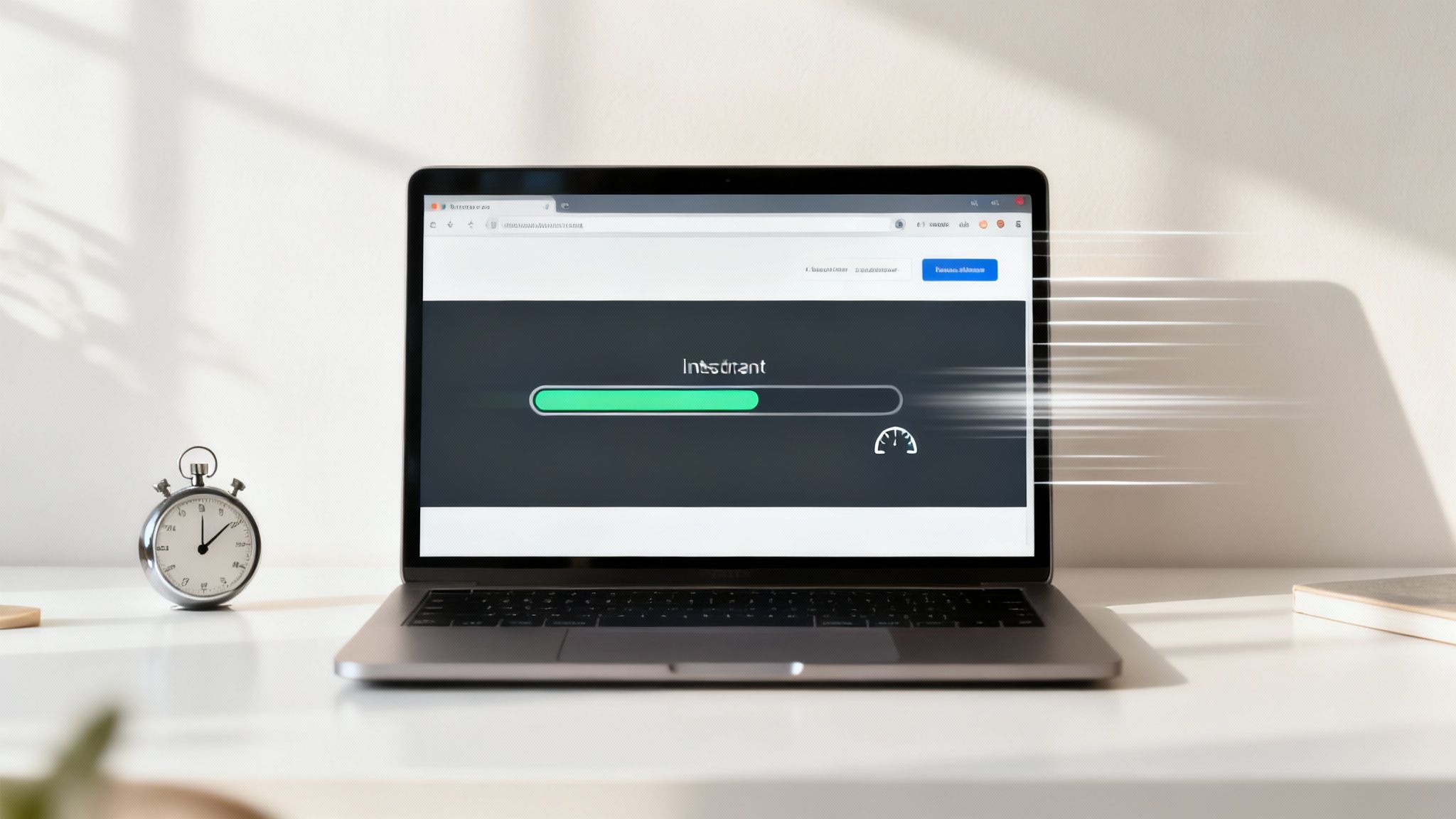
3. Make Your Website Super Fast
A fast website is like a fast-food drive-thru: people get what they want quickly and leave happy. A slow website is like being stuck in traffic—it makes people antsy, and they’ll probably just turn around and leave. Making your site speedy is one of the most powerful small business web design tips because every single second counts.
Big companies like Amazon found that even a tiny delay can lose them tons of money. For a small business in Columbus or Newark, a speedy site means a customer stays to book your service instead of going to your competitor. Vroom vroom!
Why It’s a Big Deal
Google loves speed. A faster website can help you show up higher in search results, which means more people will find you. Who doesn’t want that?
Besides what Google thinks, fast sites just work better. When someone can quickly find your phone number or fill out a form, they are much more likely to become a customer. Slow sites are frustrating and scare away good leads.
Super Simple Tip: A fast website isn’t just for tech geeks. It’s a way to show your customers you care about their time. It’s like having a clean, welcoming shop—it makes a great first impression.
How You Can Do It (It’s Easy!)
Speeding up your site is totally doable. You can start with a few simple things that make a huge difference.
- Shrink Your Pictures: Big pictures are the #1 reason websites are slow. You can use free online tools like TinyPNG to make your pictures smaller without making them look bad.
- Get Good Hosting: Your web host is like the engine in your car. A cheap, slow one will hold you back. Think about upgrading if you can.
- Test Your Speed: Use Google’s PageSpeed Insights tool. It’s a free report card for your website that tells you exactly what to fix. Aim for a score of 90 or higher!
Making these changes is a great start. If this sounds too techy, don’t sweat it! This is the kind of stuff we love to do. We can tune up your website to make it lightning fast.
4. Make Your Menu Simple and Clear
A simple menu is like having clear, easy-to-read signs in a grocery store. It shows your visitors exactly where to go without them having to guess where the good snacks are. A good menu helps people find important pages, like your services or your contact info, without getting frustrated.
This is a super important part of good small business web design because it keeps people on your site longer. If a potential customer gets confused, they’ll just leave and go to a competitor’s site. Bye-bye, business!

Why It’s a Big Deal
A clear menu makes your website easy and fun to use, which is a big deal for search engines like Google. When people can easily find what they’re looking for, they stay on your site longer. This sends a good signal to Google that your site is helpful.
This helps you get more leads. A plumbing company in Newark with a clear “Emergency Services” button in its menu will get more calls than one that hides it. Simple navigation means more money in your pocket. It’s that easy.
Super Simple Tip: Your website’s menu isn’t just a list of links; it’s a map for your customers. If the map is confusing, they’ll get lost and give up.
How You Can Do It (It’s Easy!)
Organizing your website’s menu is a simple job you can plan out today. The goal is to make it so easy, a puppy could use it.
- Don’t Have Too Many Choices: Stick to 5-7 main things in your menu. Too many options are confusing. Think “About,” “Services,” “Prices,” and “Contact.”
- Use Normal Words: Avoid weird words like “Solutions.” Use clear labels like “Roof Repair” or “Our Menu.”
- Make it “Sticky”: A sticky menu stays at the top of the screen as people scroll down the page. That way, they can always find their way around, no matter where they are.
Making your site easy to explore is something you can totally do, and it will lead to happier customers. If you’re not sure where to start, we can help you create a menu that’s simple and smart.
5. Use Awesome, High-Quality Pictures
You’ve heard that a picture is worth a thousand words. Well, for your website, it might be worth a thousand customers! Using great photos isn’t just about looking pretty; it’s about building trust right away. Think of your website’s pictures as its handshake: blurry and weak, and people will back away. Strong and clear, and you’ll pull them in.
This is one of the best small business web design tips because great pictures tell your story in a flash. A local restaurant in Newark with yummy-looking photos of its food will get more reservations than one with dark, grainy phone pictures. It’s that simple. Real pictures show you’re a real, professional business people can trust.
Why It’s a Big Deal
First impressions are almost all about what we see. When someone lands on your site, great pictures immediately say, “Hey, we’re the real deal!” People love looking at pictures, and it helps them connect with you, whether it’s seeing a photo of your friendly team or a cool shot of your work.
Super Simple Tip: Try to avoid generic stock photos, like those super-happy people laughing at a salad. They feel fake! Use real photos of your team, your work, or your shop to make a real connection.
How You Can Do It (It’s Easy!)
Getting great pictures doesn’t have to be expensive. You can start making things look better right away.
- Have a Photo Day: If you can, hiring a local photographer for even an hour can be a game-changer. Get shots of your team, your place, and your products. Have fun with it!
- Show Off Your Work: For contractors in Columbus, before-and-after photos are pure gold. They show people how awesome you are at what you do.
- Shrink Your Pictures: Remember this from the speed tip? Big pictures will slow your site down. Use free online tools like TinyPNG to make the file size smaller without hurting the quality.
- Add a Description: Add a simple sentence to every picture (this is called “alt text”). This helps search engines understand what the picture is about and helps you get found.
By using great pictures, you make your business look as good online as it is in real life. This is a powerful step you can take to win more customers. Need help with photos? We know people!
6. Tell People Why You’re Awesome (Right Away!)
This is a fancy way of saying: “Here’s why you should pick us over the other guys.” It’s the most important sentence on your website. It should tell visitors what makes you special and how you can help them. Think of it as your 10-second elevator pitch, right at the top of your homepage where no one can miss it.
When someone lands on your site, they decide in just a few seconds whether to stay or leave. A clear, powerful message grabs their attention and makes them think, “Aha! I’m in the right place.” This could be the difference between a new customer and a lost one.
Why It’s a Big Deal
A great opening line instantly answers your customer’s biggest question: “What’s in it for me?” It cuts through all the noise and tells them exactly how you’ll make their life better. This isn’t just about listing your services; it’s about promising a great result.
This is one of our favorite small business web design tips because it works like magic. By telling people what makes you special, like “Same-Day Service Guaranteed” for a plumber, you make it much easier for them to choose you.
Super Simple Tip: Your message should be about the benefits, not just the features. Instead of saying “We use advanced software,” say “We’ll save you 5 hours a week.” People want to know how you’ll help them!
How You Can Do It (It’s Easy!)
Writing a killer opening line is something you can do right now. You just need to think about what makes your business great.
- Be Loud and Proud: Put your message right at the top of your homepage in big, bold letters.
- Use Simple Words: Don’t use confusing jargon. If your cousin can’t understand it, it’s too complicated. Keep it simple!
- Focus on One Big Promise: Don’t try to be everything to everyone. Highlight one or two things that really make you different.
Clearly stating why you’re the best choice is a simple but powerful change you can make today to get more customers. If you need help finding the right words, we’re great at that!
7. Make Your Contact Forms Easy to Use on a Phone
A phone-friendly contact form is a simple, easy-to-use form on your website that lets customers give you their info without any headaches. Think of it as a friendly digital handshake; you want to make it quick and painless. Since most people find you on their phones, a clunky, hard-to-use form is a surefire way to lose a customer.
The goal is to make it as easy as possible. Shorter forms get filled out way more often than long ones. Whether someone is trying to book an appointment or ask a question, a simple form turns a curious visitor into a real lead.
Why It’s a Big Deal
A good form is a direct line to your next customer. It shows you respect their time by only asking for what you really need. On a tiny phone screen, nobody wants to struggle to fill out a dozen boxes. A simple form makes it super easy for people to get in touch with you.
This is one of the most direct small business web design tips for getting more leads. A good form doesn’t just collect info; it starts a friendly conversation with a potential customer.
Super Simple Tip: The best contact form is the one people actually finish. Every extra question you add is another reason for someone to give up and go to your competitor. Keep it short and sweet!
How You Can Do It (It’s Easy!)
Fixing your contact forms is a simple change that gets big results, and you can start right away.
- Ask for Less: Only ask for the most important info. Do you really need their fax number right now? Probably not. A name and an email or phone number is usually enough.
- Use Big, Tappable Boxes: Make sure each box and the “submit” button are big enough to be easily tapped with a thumb on a phone.
- Make Phone Numbers Optional: A lot of people don’t like giving out their phone number. Making it optional can get more people to fill out your form.
- Add a Privacy Note: A short sentence like “We’ll never share your info” can make people feel much safer and more willing to hit “submit.”
These simple tweaks can make a huge difference in turning your website visitors into paying customers. To learn more about how to get unlimited leads for contractors, you can check out our guide on generating more business on cherubinicompany.com.
8. Show Off Your Happy Customers (Trust Signals!)
Trust signals are like getting a thumbs-up from a friend before you try a new restaurant. They are little things on your website that show visitors you are a real, trustworthy business, and that other people have had a great experience with you. Think of customer reviews, star ratings, and success stories as your digital high-fives.
For a small business, building this trust online is everything. When a potential customer in Licking County is deciding between two plumbers, they’re way more likely to choose the one with happy reviews on their site. Showing off these good vibes makes people feel more confident choosing you.
Why It’s a Big Deal
This works because of something called “social proof.” Basically, people like to do what other people are doing. When visitors see that other real people trust your business, it makes them feel good about their decision to hire you or buy from you.
Showing these trust signals can directly lead to more sales. It’s one of the most effective small business web design tips because it answers the visitor’s biggest secret question: “Can I trust this business?”
Super Simple Tip: A great review with a real person’s photo is way more powerful than any fancy marketing slogan you could ever write. It feels real!
How You Can Do It (It’s Easy!)
Adding trust signals to your site is easy. You can start by simply asking your happiest customers for a little help.
- Show Off Customer Reviews: Ask your happy customers for a good word. You can even offer a small discount on their next purchase as a thank you. Put these awesome reviews right on your homepage.
- Display Your Star Ratings: If you have great reviews on Google or Yelp, show them off! You can add a little badge to your site that displays your star rating.
- Show Your Badges: Are you a member of the Better Business Bureau or have a special award? Add those logos to your site to show you’re a pro.
Building a good reputation is key, and we can help you show it off on your website. After all, you’ve earned it!
8-Point Small Business Web Design Comparison
| Element / Strategy | Implementation Complexity 🔄 | Resource Requirements ⚡ | Expected Outcomes 📊 | Ideal Use Cases ⭐ | Key Advantages & Tips 💡 |
|---|---|---|---|---|---|
| Mobile-First Design Approach | Moderate–High: responsive layouts, touch optimization, extensive device testing | Medium: front‑end dev time, device testing, responsive frameworks (e.g., Bootstrap) | Higher mobile reach; improved SEO (mobile‑first indexing); better conversion rates | Local businesses, e‑commerce, sites with majority mobile traffic | Better mobile UX; tip: test on real devices, prioritize touch targets, optimize images |
| Clear and Compelling CTA Buttons | Low: design, placement, and simple A/B tests | Low: design resources, A/B tools (optional) | Significant conversion uplift (typical +30–50%) | Landing pages, product pages, signup flows, promotions | Removes user uncertainty; tip: use action verbs, contrast colors, >=44×44px touch size |
| Fast Loading Speed Optimization | High: technical work (caching, minification, CDN, audits) | Medium–High: developer time, possible paid CDN/tools, monitoring | Better SEO (Core Web Vitals), lower bounce, higher conversions (every 100ms matters) | High‑traffic sites, e‑commerce, mobile audiences | Improves retention & rankings; tip: use CDN, compress images (WebP), aim PageSpeed 90+ |
| Intuitive Navigation Structure | Medium: information architecture, menu design, user testing | Low–Medium: UX research, content reorganization | Reduced bounce, increased pages/session, improved crawlability | Content‑heavy sites, e‑commerce catalogs, service sites | Simplifies discovery; tip: limit main items to 5–7, use breadcrumbs and sticky nav |
| Professional High‑Quality Imagery | Low–Medium: sourcing or producing and editing images | Medium: photography budget or premium stock + editing tools | Higher engagement (+~80% vs text), stronger brand trust and conversions | Hero sections, product pages, social sharing, hospitality & food | Builds credibility; tip: use authentic photos, consistent grading, optimize file sizes |
| Strong Value Proposition & USP | Medium: research, messaging, and copy refinement | Low–Medium: customer research, copywriting, testing | Clearer visitor understanding; conversion uplift (+20–40%), reduced bounce | Homepages, landing pages, lead generation, new brand positioning | Clarifies differentiation; tip: place above the fold, use specific outcomes and A/B test |
| Mobile‑Friendly Contact Forms & Lead Capture | Low–Medium: form design, integration, privacy compliance | Low–Medium: form builders, CRM integration, dev for backend | Higher form completion (short forms +25–50%); better lead quality | Lead gen pages, booking/appointment sites, demo signups | Reduces friction; tip: 3–5 fields, single‑column mobile layout, include privacy notice |
| Trust Signals & Social Proof Integration | Low–Medium: collect, verify, and display testimonials/reviews | Low: customer outreach, review platforms, simple UI placement | Increased conversions (+15–34%), reduced purchase anxiety | New brands, high‑value purchases, local services, B2B SaaS | Boosts credibility; tip: use real photos/videos, schema markup, rotate testimonials |
You’ve Got This! Now, Let’s Get to Work.
See? That wasn’t so bad! Making a website that actually helps your business grow isn’t some big, scary secret. It’s not about knowing weird code or having a giant budget. A great website is just about making things easy, clear, and helpful for your customers. It’s that simple.
We’ve walked through eight powerful and easy ideas together. Think about how a customer feels when they land on a website. They want to know you can solve their problem, find your phone number quickly, and not have to wait forever for a page to load. Each of the small business web design tips in this article is designed to do just that: make every visitor feel welcome and confident.
Your Simple Plan to Get Started
Feeling a little overwhelmed? Don’t be. You don’t have to do everything at once. The goal is to just get started.
Here’s your easy, one-step-at-a-time plan:
- Pick Just One Thing: Look back at the list. Which tip seems the easiest to do right now? Maybe it’s rewriting your main headline, adding a happy customer quote, or just making your phone number bigger.
- Do It: Spend 30 minutes making that one small change. You’ll be amazed at how much better your site can feel with just one little fix.
- See What Happens: Keep an eye on your contact form or phone calls. Small tweaks can lead to big improvements!
You can do this! Your website is your hardest-working employee. By putting these simple small business web design tips to work, you’re building a tool that brings in more business and helps you succeed. You absolutely have the power to make it happen.
Ready to turn your website into a lead-generating machine but not sure where to start? At The Cherubini Company, we’ve been building simple, effective WordPress websites that get real results for businesses just like yours since 1998. Let us handle the hard stuff so you can focus on what you do best. Contact The Cherubini Company today for a friendly chat about your website. No pressure, we promise