
Ever feel like your website is just… sitting there? Not doing much? It’s supposed to be your superstar helper, working 24/7 to bring in customers. But if it’s confusing, slow, or just plain old, it might be scaring people away instead of inviting them in. Yikes!
The good news is, you don’t need to be a tech genius to fix it. Getting your website to work hard for you is way easier than you think. A great website has a clear job, whether it’s getting folks to call your HVAC business or making it simple to share photos, like in the case of creating a dedicated photo sharing website. It all starts with a simple, friendly plan.
We’re going to walk you through 10 super simple website design best practices that anyone can understand. Think of this as your friendly guide to turning your website from a lazy couch potato into a customer-finding machine. You can totally do this, and we’re here to help if you need a hand. By the end, you’ll have a clear, easy plan to make your website amazing and start getting more customers.
1. Make it Work on Phones First (Mobile-First Design)
Think about how you look things up. You’re probably on your phone, right? Most people are. “Mobile-first” just means we design your website for a small phone screen first, and then make it look good on bigger screens like tablets and computers. This is a top rule for good website design best practices because so many people will see your site on their phone.
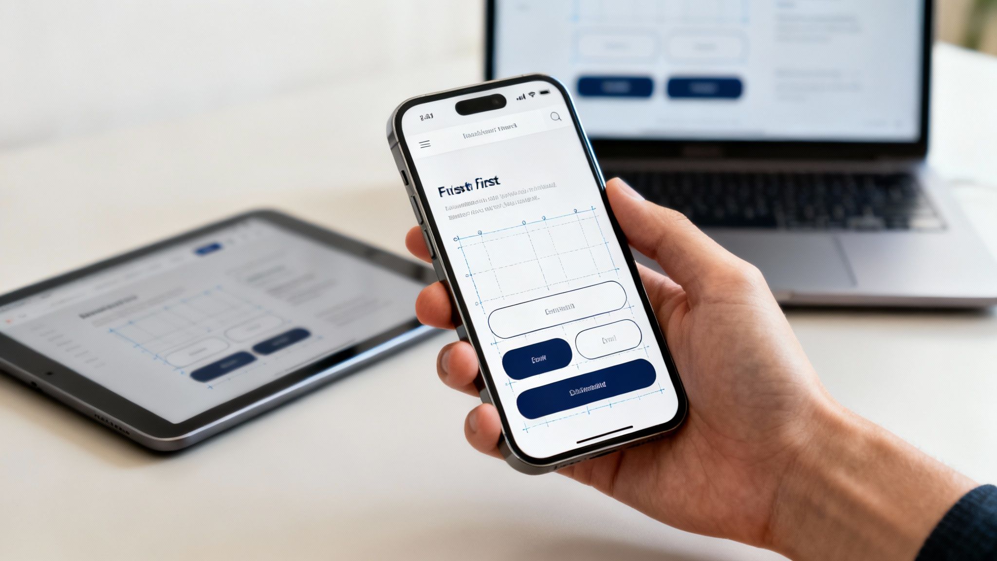
Starting with the phone view forces you to put the most important stuff first, like your phone number or a “Book Now” button. It’s like packing a suitcase—you put the must-haves in first! This makes your site cleaner, faster, and easier to use on any device.
How to Get Started
You can absolutely do this! The trick is to keep it simple.
- Pick What’s Most Important: What do your customers need to see right away? Your services? Your phone number? Put that right at the top.
- Design for Thumbs: Make sure your buttons are big enough for people to tap easily. If they have to pinch and zoom, they’ll just get annoyed and leave.
- Look at it on Your Phone: Don’t just guess. Open your site on your own phone and ask a friend to try it on theirs. Does it look good? Is it easy to use?
- Add More for Big Screens: Once the phone version is perfect, you can add extra goodies like bigger pictures for people visiting on a computer.
This isn’t just a fancy trick; it’s how Google decides which websites to show first. By making phone users happy, you’re also making Google happy. It’s a win-win!
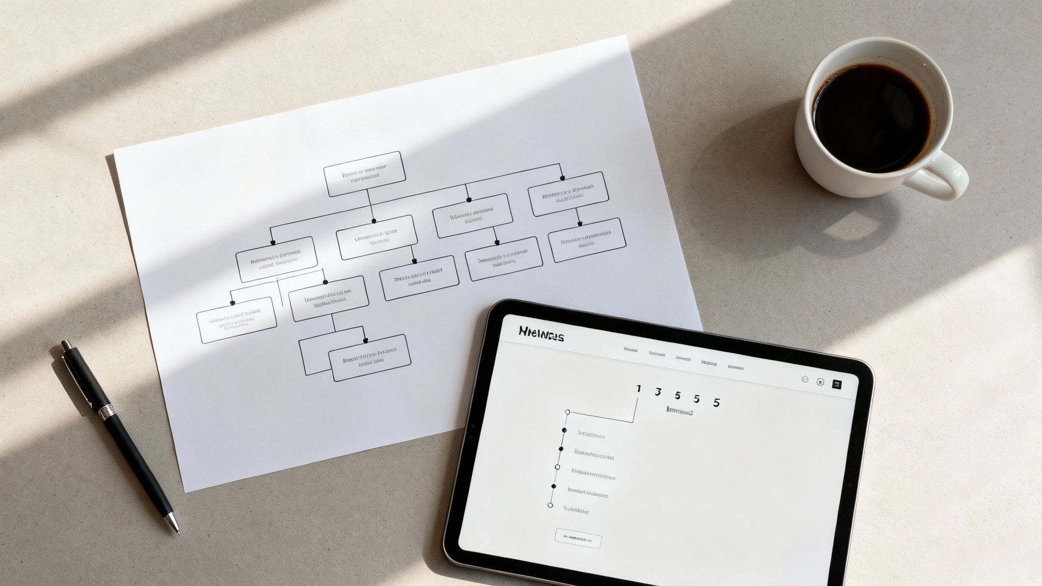
2. Make it Easy to Find Things (Clear Navigation)
Imagine your website is a grocery store. If the milk is hidden in the cereal aisle, customers will get confused and leave. Clear navigation is like having big, friendly signs that show people exactly where to go. This is a super important part of website design best practices because it helps people find what they need without getting lost.
A well-organized site keeps people from clicking away. When they can easily find your services, contact page, or photos of your work, they’re much more likely to become a customer. It’s that simple!
How to Get Started
You can totally map out your website like a pro. The goal is to make it super easy for your visitors.
- Keep Your Menu Short: Try to have only 5-7 main things in your menu. Think “Home,” “Services,” “About Us,” and “Contact.”
- Use Simple Words: Don’t get fancy with your menu names. Use clear words like “Plumbing Services” instead of “Our Water Wizardry.” People should know exactly what they’re clicking on.
- Group Similar Things Together: If you have a bunch of different restoration services, put them all under one main “Services” button.
- Ask a Friend to Test It: Ask someone to find your phone number or a specific service on your site. If they struggle, you know you need to make it clearer.
By organizing your site, you help people get right to the good stuff. That’s how you turn a curious visitor into a happy customer.
3. Make Your Website Super Fast (Fast Loading)
Nobody likes to wait. If your website takes forever to load, people will click the “back” button before they even see what you do. Making your site load in a snap is a huge part of good website design best practices. A speedy site keeps visitors happy and helps you show up higher in Google searches.
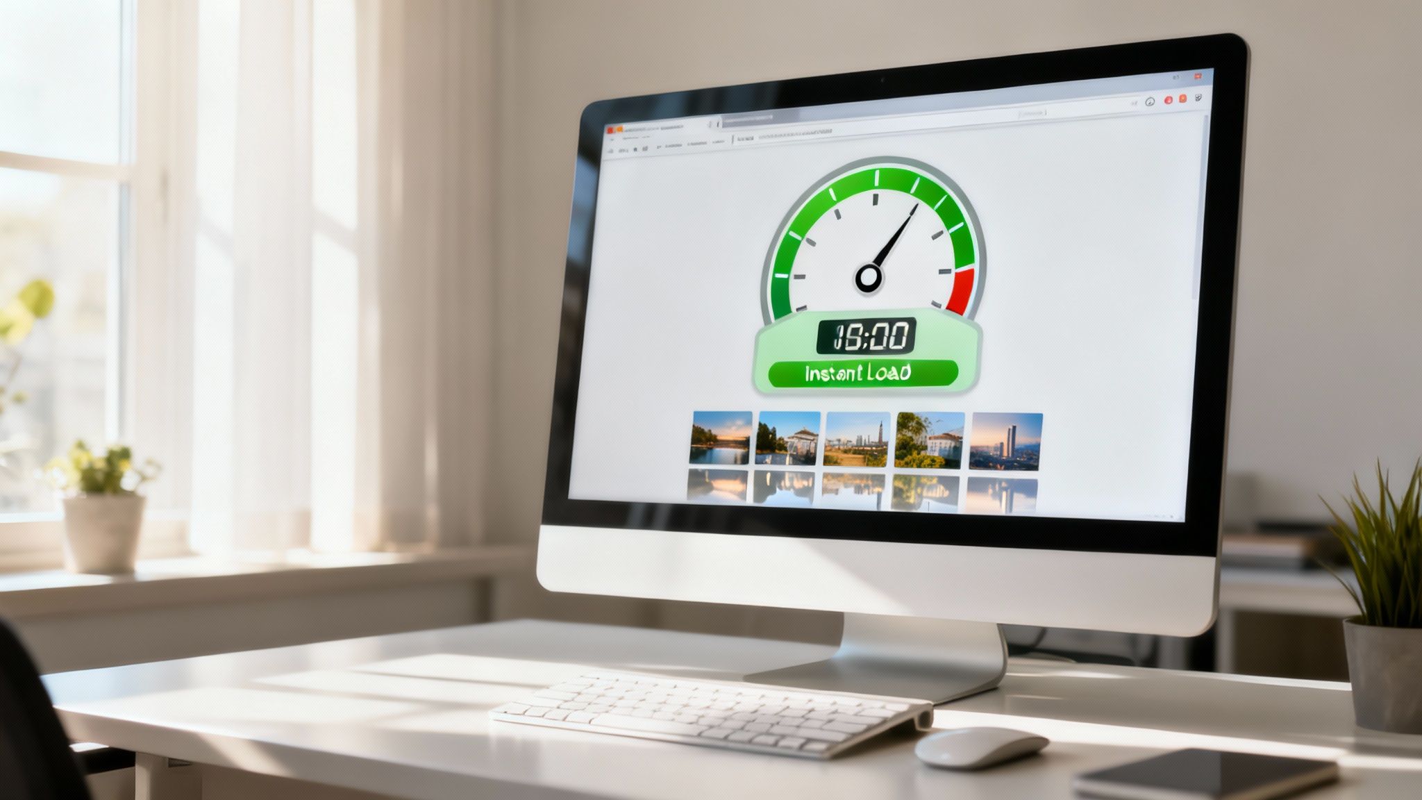
Seriously, this is a big deal. A slow website is like having a single cashier on Black Friday—total chaos! A fast website feels professional and shows customers you respect their time.
How to Get Started
You don’t need to be a computer whiz to speed things up! A few simple tricks can make a world of difference.
- Shrink Your Pictures: Big pictures are the #1 reason websites are slow. You can use free online tools to make your picture files smaller without making them look bad. It’s like magic!
- Aim for 3 Seconds or Less: Your website should load in about the time it takes to snap your fingers. Test your site’s speed with Google’s free tools to see how you’re doing.
- Get Good Hosting: Hosting is like the land your website is built on. Good hosting makes everything faster. You can learn more about website hosting options here.
- Use “Caching”: This sounds technical, but it’s simple. Caching is like your website remembering a visitor. The next time they come back, the site loads instantly. Most website builders have a simple button to turn this on.
Focusing on speed makes everyone happier and can directly lead to more calls and sales for your business.
4. Make Sure Everyone Can Use Your Site (Accessibility)
Imagine if your front door only opened for certain people. That wouldn’t be good for business, right? An “accessible” website makes sure your digital front door is open to everyone, including people with disabilities who might use special tools to browse the internet. This is a very important part of website design best practices.
This isn’t just about being nice; it’s smart business. An accessible site welcomes more customers and shows you care. It just makes your website better for everybody.
How to Get Started
You can make your website more welcoming today. It’s easier than you think!
- Describe Your Pictures: Add a short description to your images (this is called “alt text”). If you have a picture of a plumber fixing a sink, the description could be “plumber fixing a leaky kitchen sink.” This helps people who can’t see the pictures understand what’s on the page.
- Check Your Colors: Is your text easy to read? Light gray text on a white background is a no-go. Make sure there’s a big difference between your text color and background color.
- Label Your Forms: Make sure every box in your contact form has a clear label, like “Your Name” or “Your Email.”
- Try Using Just Your Keyboard: Can you get around your whole website using only the “tab” key on your keyboard? If you can, that’s a great sign that it’s easy for everyone to use.
Making your site easy for everyone to use helps more people find you and shows you’re a thoughtful business owner.
5. Guide Their Eyes (Visuals and Text)
Think of your website like a sign on the highway. You want the most important message—like your phone number—to be big and bold so people see it first. This trick of using size, color, and spacing to guide a visitor’s eye is a key part of website design best practices. It tells people what to look at first, second, and third, so they don’t get confused.
When you use big, bold headlines and clear, easy-to-read text, you make your pages a breeze to understand. People can quickly scan the page and find exactly what they’re looking for. It’s about making your message pop!
How to Get Started
You can totally do this! Think of yourself as the tour guide for your website.
- Don’t Use Too Many Fonts: Stick to just one or two fonts that look good together. Using too many fonts makes a page look messy, kind of like a ransom note.
- Make Headlines BIG: Your main headline should be the biggest text on the page. Then make your sub-headings a little smaller, and your regular text the smallest (but still easy to read!).
- Give Things Space: Don’t cram everything together. Leaving some empty space around text and pictures makes the page feel calm and easy to look at.
- Make Sure Text is Readable: Black text on a white background is a classic for a reason: it’s super easy to read. Make sure your text color stands out from the background.
By organizing your page this way, you make your website way more effective. A clean design helps you capture the eye of customers and makes your business look professional and trustworthy.
6. Tell People What to Do Next (Call-to-Action)
Think of your website as a friendly guide. A “call-to-action,” or CTA, is that final, helpful instruction telling your visitor what to do next. It’s the big, shiny button that says “Get a Free Quote” or “Call Us Now.” This is a super important part of website design best practices because without it, visitors might just leave, wondering, “Okay… now what?”
A good CTA turns a curious visitor into a real customer. It should stand out with a bright color and use simple, action-packed words. Your goal is to make the next step so obvious and easy they can’t help but click it.
How to Get Started
You can totally make your buttons better today. The secret is being clear and direct.
- Use Action Words: Instead of a boring button that says “Submit,” try something exciting like “Get My Free Guide!” or “Schedule My Appointment!”
- Make it Stand Out: Pick a color for your button that’s different from the rest of your site. If your site is mostly blue, try an orange or green button to make it pop.
- Make it Big Enough: Your buttons should be easy to tap on a phone. No one likes trying to hit a tiny target with their thumb.
- Put it in the Right Spot: Place your button right after you’ve explained how great your service is. For more ideas, check out these tips for creating a lead-generating website.
By making your buttons clear and inviting, you guide people straight to becoming a customer. This simple change can make a huge difference in getting more business.
7. Show People They Can Trust You (Trust Signals)
Think of your website like your storefront. Would you walk into a shop that looked messy and dark? Probably not. “Trust signals” are things on your website that make visitors feel safe and confident in your business. This is a vital part of website design best practices because people won’t call you or buy from you if they don’t trust you.
Showing things like customer reviews, security logos, and your real phone number builds trust instantly. It tells people, “Hey, we’re a real, honest business!”
How to Get Started
Building trust is easier than you think! It’s all about being open and showing off your great reputation.
- Get the Padlock: Make sure your website has a little padlock icon in the web address bar. This is called an SSL certificate and it shows your site is secure. It’s a must-have today. Learn more about why SSL is so important.
- Show Off Your Happy Customers: Add a few quotes from real customers. Seeing that other people had a great experience with you is super powerful.
- Display Any Security Logos: If you use well-known services for payments, like PayPal or Stripe, show their logos. People recognize and trust them.
- Make it Easy to Contact You: Don’t hide your phone number and address. A clear “Contact Us” page shows you’re a real business and you’re not afraid to talk to your customers.
By adding these simple trust signals, you’re telling every visitor, “We’re trustworthy, we’re secure, and we’re here to help.” That feeling of safety leads directly to more calls and sales.
8. Make Forms Easy to Fill Out on a Phone (Mobile Forms)
Think about the last time you tried to fill out a long form on your phone. Was it annoying? Exactly. Mobile-friendly forms are designed to make this super quick and painless. This is a critical part of website design best practices because if your contact form is a pain to use, you’ll lose customers who were ready to get in touch.
Good mobile forms have big buttons, only ask for what’s really needed, and even bring up the right keyboard (like the number pad for a phone number). This makes it so much easier and faster for people to send you their info.
How to Get Started
You can totally fix your forms! The key is to make it as easy as possible for your customer.
- Keep It Short and Sweet: Only ask for the information you absolutely need. Do you really need their fax number? Probably not. The shorter the form, the better.
- One Column is Best: On a phone, stack your form fields in one straight line. It’s much easier for people to follow along.
- Use the Right Keyboard: You can set the box for a phone number to automatically bring up the number keyboard. It’s a small thing that makes a big difference!
- Make the “Send” Button Big: Your “Send” or “Submit” button should be large, bright, and easy to tap with a thumb.
An easy-to-use form can be the difference between getting a new customer and losing one. It’s that simple!
9. Keep Your Look the Same Everywhere (Consistent Branding)
Think of a big brand like McDonald’s. Their signs and buildings look the same everywhere, right? That’s consistency. Your website should do the same thing. Every page should use the same colors, fonts, and button styles. This is a crucial part of website design best practices because it makes your business look professional and trustworthy.
When your “Contact Us” button looks the same on every page, people don’t have to hunt for it. They just know what to do. This consistency makes your website easier to use, which keeps people on your site longer.
How to Get Started
You don’t need a fancy design team to do this. You just need a simple plan.
- Pick Your Style: Choose two main colors, one or two fonts, and a style for your buttons. Write them down so you don’t forget!
- Make One Perfect Button: Design one great-looking button. Then, just copy and paste it wherever you need one. Easy!
- Do a Quick Check: Before you add a new page, look at it next to your other pages. Does it match? If not, tweak it until it does.
- Keep it Organized: Keep your main colors and fonts written down in a simple document so you can always find them.
Creating this consistent look makes your brand easy to remember and helps people feel comfortable on your site. It’s a simple step that makes you look like a total pro.
10. Learn From Your Visitors (Analytics and Testing)
Guessing what works on your website is like playing pin the tail on the donkey. Using data is like taking off the blindfold. This just means you look at what your visitors are actually doing on your site to make it better. It’s a key part of website design best practices because it takes the guesswork out of improving your website.
Instead of just hoping for the best, you can see what people click on, test different headlines, and see what changes get you more calls or sales. This is also key for things like e-commerce, where you can use data and proven tactics to improve e-commerce conversion rates.
How to Get Started
You don’t need a science degree to start using data. It’s simpler than you think!
- Install Google Analytics: It’s free and it’s the best way to start. It shows you how many people are visiting your site and what pages they look at.
- Try a Simple Test: Change just one thing on a page, like making your “Contact Us” button green instead of blue. See if more people click the new green one. That’s a test!
- See Where People Click: There are tools that can show you a “heatmap” of your website, which shows you exactly where people are clicking. It’s like seeing through their eyes!
- Just Ask!: Add a simple question on your site like, “Was this page helpful?” The answers you get are pure gold.
Using data helps you make smart choices that get real results. This is how you turn your website into a powerful tool for your business and get found online. You can learn more with our small business SEO checklist.
10-Point Website Design Best Practices Comparison
| Item | 🔄 Implementation complexity | ⚡ Resource requirements | 📊 Expected outcomes | 💡 Ideal use cases | ⭐ Key advantages |
|---|---|---|---|---|---|
| Mobile-First Responsive Design | Moderate — responsive CSS, progressive enhancement, device testing | Moderate — frameworks, device testing, responsive assets | Improved mobile UX, SEO lift, higher mobile conversions | Mobile-heavy audiences, new sites, e-commerce | Prioritizes mobile users; single scalable codebase |
| Clear Navigation and Information Architecture | Moderate — user research, content structuring | Moderate — UX research, content audits, testing | Faster task completion, lower bounce, better SEO | Large content sites, catalogs, knowledge bases | Improves findability and accessibility |
| Fast Loading Times and Performance Optimization | High — technical tuning, monitoring, trade-offs | High — dev time, CDNs, tooling, performance testing | Faster loads, higher conversions, lower server costs | High-traffic, media, e-commerce, mobile networks | Directly improves engagement, conversions, SEO |
| Accessibility and Inclusive Design | Moderate — semantic markup, ARIA, testing | Moderate — audits, assistive-tech testing, training | Broader audience reach, legal compliance, better UX | Public sector, enterprise, inclusive-brand sites | Increases reach and ensures compliance |
| Strong Visual Hierarchy and Typography | Moderate — design iteration and testing | Low–Moderate — designers, font choices, style guide | Better readability, faster scanning, improved engagement | Editorial sites, landing pages, branding sites | Enhances clarity, professionalism, and engagement |
| Clear and Compelling CTA Design | Low — focused design + iterative testing | Low — design time, A/B testing tools | Higher click-through and conversion rates | Landing pages, signups, checkout flows | Direct, measurable lift in conversions |
| Trust Signals and Security Indicators | Low — add badges/policy UI; requires real practices | Low–Moderate — certifications, testimonials, design | Increased conversions, reduced cart abandonment | E-commerce, finance, subscription services | Builds credibility and reduces user friction |
| Mobile-Optimized Forms and Input Design | Moderate — input tuning, validation, device UX | Moderate — front-end dev, mobile testing | Reduced abandonment, better data quality | Mobile signups, checkout, lead capture | Lowers friction; improves completion and accuracy |
| Consistent Branding and Visual Design System | High initially — system creation and governance | High — cross-functional team, tooling (Figma, Storybook) | Faster scaling, consistent UX, reduced rework | Large organizations, multi-product platforms | Ensures consistent brand experience and efficiency |
| Analytics, Testing, and Data-Driven Optimization | High — setup, experimentation, analysis | High — analytics/experiment tools, analysts, traffic | Evidence-based improvements, higher ROI from tests | Mature/high-traffic sites, product teams | Enables validated decisions and measurable impact |
You’ve Got This! Let’s Build a Website That Works.
And there you have it! Ten powerful website design best practices that can turn your website from an online pamphlet into a customer-getting machine. It might seem like a lot, but you don’t have to do it all at once. You don’t need to be a tech wizard to start making a real difference.
Think of it like fixing things around the house. A slow-loading page is like a leaky faucet. Confusing buttons are like a squeaky door. Each little fix you make stops a potential customer from dripping away.
Your Simple Starting Point
Don’t try to do everything at once. You’ll just get overwhelmed! Instead, pick one or two things from our list that sound easy to you right now.
- Easy Win #1: Check Your Buttons. Look at your website on your phone. Is your “Call Now” button big and easy to see? If not, making it bigger and a brighter color is a quick fix that can help people take action right away.
- Easy Win #2: Add a Friendly Face. Can you easily add a customer review or a photo of your team to your homepage? These little things build a lot of trust and show new visitors that you’re a real, local business.
The goal is progress, not perfection. Every small improvement you make adds up. By focusing on these simple ideas, like making your site fast and easy to navigate, you are making it more helpful. And a helpful website gets more visitors, builds more trust, and brings more business through your door.
Following these website design best practices is all about putting your customer first. When you show them you respect their time and want to make their life easier, you’re not just building a better website; you’re building a stronger business. You can do this!
Ready to turn these ideas into a website that works as hard as you do? At The Cherubini Company, we build simple, powerful websites for local businesses that are designed to get results. If you’d like a partner to handle all this for you so you can focus on what you do best, The Cherubini Company is here to help you succeed.